Equals Money
Company
Equals
Industry
Fintech / Stablecoin Payments
Role
Lead Brand Designer
Ownership
-
Evolved the brand system across guidelines, templates and digital design
-
Developed clearer rules for type, colour, layout, grids and logo usage
-
Created reusable assets for marketing, sales and product teams
-
Built motion and product storytelling assets for complex financial services
-
Worked with stakeholders to improve consistency across key touchpoints
Challenge
Create a more scalable brand system for a growing fintech business with multiple products, audiences and communication needs.
Solution
Evolved the visual identity, guidelines, templates, motion style and product storytelling into a more practical, reusable system.
Result
Improved consistency across teams and channels, helping Equals communicate complex financial services more clearly, credibly and efficiently.
Impact
-
Helped mature the Equals brand from a set of visual assets into a practical system that teams could use at scale.
-
Created clearer rules and reusable patterns that improved consistency across high-value marketing and sales touchpoints.
-
Supported more confident communication of complex fintech products across different audiences, channels and formats.
-
Strengthened the brand’s ability to scale without losing clarity, quality or consistency.
-
Evolved the brands identity to feel more sophisticated, modern and coherent for a fintech business.

One of my first tasks at Equals Money was to review and revamp the existing brand guidelines, turning them into a clearer and more practical foundation for the wider business. The aim was to give teams better guidance on how the brand should look, sound and behave across marketing, product, sales and commercial touchpoints.
I introduced new direction across brand story, tone of voice, colour, type styles, grid systems and logo usage, helping bring more consistency and confidence to the way the brand was applied. This gave the team a stronger framework to work from, making it easier to create work that felt joined-up, professional and recognisably Equals Money.

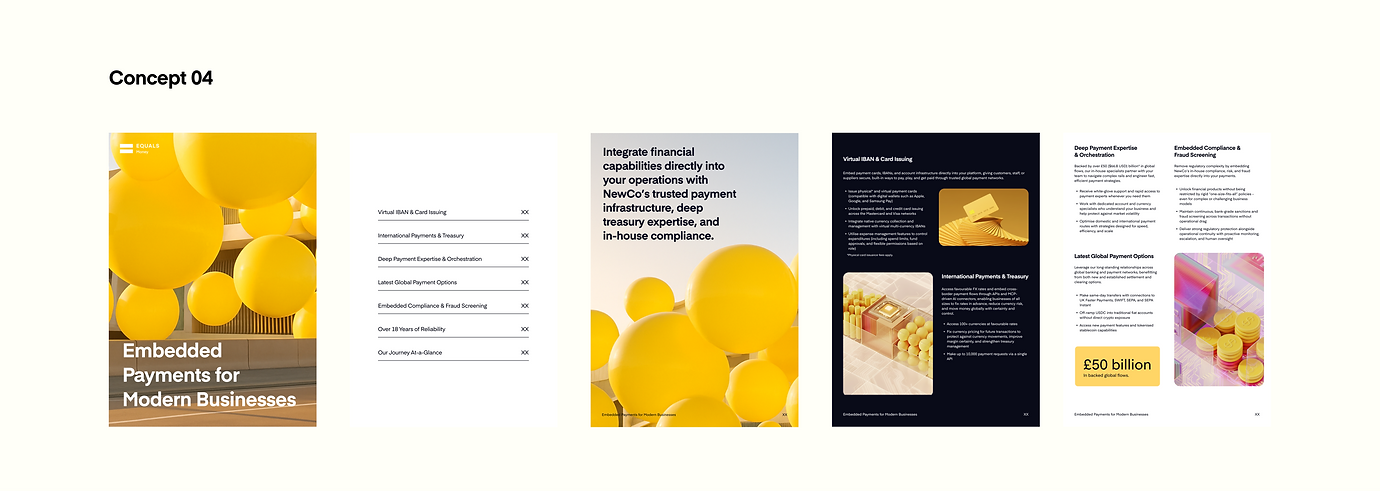
A brief to explore the brand through an Embedded Finance white paper became a really useful opportunity to push the visual language beyond the day-to-day guidelines. Because the piece needed to explain a more complex, strategic product story, it gave us space to test how the Equals Money brand could behave in a more editorial, confident and sophisticated way.
Through layout, colour, typography, data visualisation and product storytelling, the white paper helped reveal the wider potential of the brand. It showed how Equals Money could feel more distinctive and premium while still being clear, practical and trusted. For me, it became a strong proof point for where the brand could go next, giving the team a more ambitious creative direction to build from.


We then took the learning from the wider brand work, including the Embedded Finance white paper exploration, and started applying it to a more defined animation system. This became a chance to bring the brand to life through movement, using motion to add clarity, pace and personality while keeping everything consistent with the updated visual direction.
From this system, I was able to create two key videos: a general Equals Money showreel to communicate the brand in a more dynamic and engaging way, and a second video focused on explaining our White Label proposition. Together, they helped show how the brand could flex beyond static design, turning complex financial products into clearer, more polished and more memorable stories.

